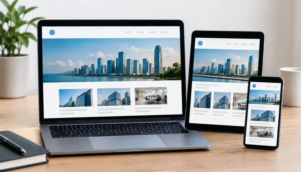
Responsive Design Comparison for Business Websites
A potential customer can form an opinion about your business before they have read a single service page. If your website is difficult to use on their mobile, takes too long to load, or makes them pinch and zoom to find a phone number, they may simply move on. A responsive design comparison helps business owners understand which website approach will give customers a better experience across mobiles, tablets, laptops and desktop screens.
For most small to medium-sized businesses, a professionally designed responsive website is the practical foundation. It gives your business one consistent online presence while adapting the layout, navigation and content presentation to suit the screen in front of the customer. But responsive design is not the only approach, and the right decision depends on your services, users and the job your website needs to do.
Why website responsiveness affects enquiries
Customers rarely interact with a website in a neat, predictable way. A homeowner might search for an emergency plumber on a mobile from the driveway. A professional services client may compare providers on a laptop during work hours. Someone may first find your business through a Google Business Profile, then return later on a tablet to make contact.
Your website needs to make sense at every stage. That means service information must be readable, enquiry forms need to be easy to complete, images should support the message rather than crowd the page, and calls to action need to remain visible without being intrusive.
Responsiveness is also closely connected to trust. A dated desktop-only layout can make an otherwise capable business look less established. By contrast, a clean custom website that works well on any device helps visitors focus on what matters: what you do, where you work, why they should choose you and how to get in touch.
Responsive design comparison: the main approaches
The terms responsive, adaptive and mobile-first are often used together, but they describe different ways of planning and building a website. Each can have a place, although they are not interchangeable.
Responsive web design
Responsive web design uses flexible layouts, images and styling rules so one website adjusts continuously to different screen sizes. A three-column desktop section may become two columns on a tablet and one clear column on a mobile. Navigation may change from a full menu into a compact menu, while buttons and form fields become easier to tap.
For many business websites, responsive design is the strongest all-round option. It supports a consistent brand presentation and gives the business one central website to maintain. When service pages, contact details or project examples are updated, those changes apply across devices rather than requiring separate versions of the same content.
The quality of the design still matters. Simply shrinking a desktop page is not responsive design done well. A custom build should reconsider the order of content, spacing, type size, image crop and interaction points for smaller screens. Mobile users should not have to work harder to find your key services or make an enquiry.
Adaptive design
Adaptive design uses set layouts created for selected screen widths. Instead of a layout flowing smoothly between sizes, the website detects the device or viewport and serves the closest prepared version. For example, there may be separate layouts for desktop, tablet and mobile.
This approach can give designers close control over particular device experiences. It may suit a specialised platform with known user devices or complex interactions that need tailored treatment. For a standard business website, however, adaptive design can create extra maintenance and testing requirements. Screen sizes continue to change, and a layout built around a limited set of breakpoints may not look its best between them.
Adaptive design is not automatically inferior. It is simply more specific. If your website has unusual functionality or a tightly controlled user environment, it may be worth considering. For most local service businesses, retailers and professional firms, a well-planned responsive site is generally more flexible over time.
A separate mobile website
Some older websites use a separate mobile version, often on a mobile subdomain. The desktop and mobile sites can have different layouts, content and navigation. This was once a common solution when mobile browsing became widespread, but it is less suitable for most modern business websites.
The main issue is duplication. Content, updates, tracking and search considerations can become more difficult when two website versions need ongoing attention. Customers may also encounter inconsistent information if one version is updated and the other is not. A single responsive website is usually clearer for visitors and easier to manage as your business evolves.
Where mobile-first fits into the decision
Mobile-first is not necessarily a separate alternative to responsive design. It is a design strategy that starts with the smallest screen and then expands for larger devices. This forces useful decisions early: What does a customer need first? Which service information is essential? Is the enquiry action clear? Are the page sections earning their place?
For businesses receiving a high share of mobile traffic, mobile-first thinking is valuable. It helps prevent a common problem where a desktop design is completed first and the mobile version becomes an afterthought. The result can be a crowded mobile page with oversized images, long blocks of copy and hard-to-use forms.
A mobile-first responsive website can still provide a polished desktop experience. The goal is not to reduce the desktop site. It is to build a clear foundation that works on mobile, then use the extra screen space on larger devices to add helpful detail, visual hierarchy and supporting content.
What to assess in a responsive design comparison
A useful comparison goes beyond whether a website fits on a phone screen. Business owners should look at how the design supports real customer actions.
First, consider navigation. Can a visitor quickly find services, locations, contact information and proof of capability? Menus should remain straightforward on mobile, particularly for businesses with several services or service areas.
Next, review enquiry pathways. A phone number should be easy to tap, forms should ask only for information your team genuinely needs, and contact calls to action should appear at logical points in the page. If visitors have to scroll through several unrelated sections before they can enquire, the website is making the process harder than it needs to be.
Page speed also deserves attention. Large unoptimised images, excessive animations and unnecessary scripts can slow a website, particularly on mobile connections. Visual quality matters, but every image and feature should have a purpose. A fast, focused page often serves a local business better than a visually busy page that delays access to the essentials.
Finally, check content hierarchy. On a desktop, visitors can see a large amount of information at once. On mobile, the page is experienced in a vertical sequence. Your strongest message, key service benefit and next action should appear early, with supporting detail available as the visitor continues.
Responsive design and online visibility
A responsive website supports the digital services built around it. Search engine optimisation relies on clear page structure, useful local service content and a site that can be crawled and understood effectively. Google Business Profile activity, business listings, social media posts and video content are more valuable when they lead people to a website that is easy to use.
The same principle applies to AIO. When AI-driven search tools and answer engines assess online information, your website should provide clear, well-organised details about your services, locations, experience and contact options. A confusing or poorly structured website makes it harder for both customers and digital platforms to understand your business.
Website design remains the centre of this work. Supporting visibility activity can bring more people to your site, but the site itself must give them a convincing reason to take the next step.
Build for customers, not device labels
The best choice is rarely about chasing a technical label. It is about building a website around the way your customers search, compare and make contact. For many Australian businesses, that means a custom responsive website planned with mobile users in mind, tested across common devices and structured to generate clear enquiries.
NuDesign helps businesses in Eltham and Melbourne’s north-east build website foundations that present services professionally and support long-term digital visibility. Before approving any design, view it as your customer would: on a mobile, with limited time, looking for a direct answer and a simple way to contact your business.